
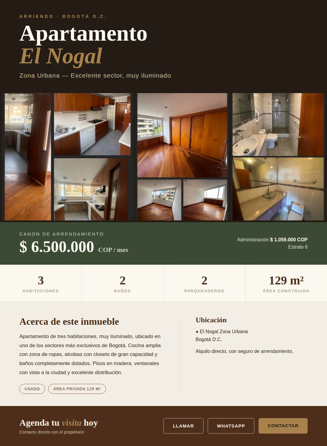
This is how we redesigned Colombia Move: more clarity to search, publish and find
We redesigned Colombia Move. Now each listing clearly answers two questions (what it is and which side you're on), housing has its own selector of 4 intentions, and pink color alerts you when someone is searching

IDIOMA DEL ARTÍCULO
Showing original language
Over the past few weeks we've been redesigning Colombia Move from top to bottom. It wasn't just a visual touch-up: they were fundamental decisions about how a marketplace should work that is half for expats landing in the country and half for local Colombians who want to sell, rent, hire, or find work without paying commissions.
In this post I tell you what changed, why we changed it, and how it feels now to publish or search for an ad. If you're one of the first to use it, your feedback is gold — at the end I ask you to tell me what works and what still doesn't.
The big decision we made: every listing must clearly answer two questions, without ambiguity. What is it (a house, a job, a service) and which side are you on (are you offering it or looking for it). That simple principle ended up changing almost everything else.
The problem we were seeing
A buyer entered the marketplace, searched for "Lenovo Thinkpad", and saw an ad that said "Lenovo Thinkpad X1 Carbon". They clicked thinking it was for sale. It wasn't: it was someone looking for it. The ad had no visual indication that distinguished it from the rest.
That case led us to a broader review. The same problem existed in jobs: "Web developer wanted" could mean "my company is hiring" or "I'm a developer looking for work". The same happened in services: "personal chef" could be a professional offering their services or a client who needed one. And in housing it was worse — categories like "house for sale" or "apartment for rent" mixed the direction within the name, forcing users to memorize combinations that didn't need to be.
The solution wasn't adding patch labels. It was rethinking the model.
An ad answers two questions
Each ad in Colombia Move now explicitly declares two things: the type (employment, service, sale or rental) and the side (you offer it or you're looking for it). They are two independent axes that don't overlap. A developer looking for work posts as Job + Looking for Work. A chef offering their services is Service + Offering. A buyer looking for a laptop is Sale + Looking to Buy. An apartment available for rent is Rental + I'm the Owner.
Visually, everything that is "someone is looking for" now appears with the same strong pink palette. Always. No exceptions. If you see an ad in pink, you know in a second that this person doesn't have what you're looking for — they want it. If you don't see pink, the person has it available.
That visual rule (pink = is looking) eliminates the confusion from the Lenovo case and the developer case at its root. You don't have to read the title carefully. You don't have to click to find out. The color tells you from a meter away on any result card.
Housing thinks differently
For most categories, two questions are enough. But housing has a particularity: it's not just "I sell or I buy" — it's also "I rent or I'm looking to rent". Four real intentions that don't fit in a binary switch.
That's why, when you post an ad in a housing category (house, apartment, room, office, farm, temporary rental), Colombia Move shows you a selector of four cards with the four clear and concrete options:
• 🏷️ For Sale — my property is for sale
• 🔍 I want to buy — I'm looking for a property to buy
• 🔑 Rental — I'm the owner, looking for a tenant
• 🔍 I'm looking for a rental — I want to rent a property
One click, done. You don't have to select the type first and then the side in two separate steps. The four cards show you the four possible combinations and you choose the one that describes your intention. Then you fill out the rest of the form normally.
And before you ask: yes, fincas fall into all four options. There are people who sell them, people who buy them, owners who rent them out for weekends, and travelers looking to rent one for vacation. We used to have them restricted to sales only — poor design. Now all housing categories accept all four options. You decide which one applies.

Filters that understand the context
On each category and section page there is now a three or four button filter that allows you to filter the list by intent with one tap. For example:
If you enter /section/jobs views: Everyone · 💼 Hiring · 🧑💼 Looking for work. An employer filters available candidates; a candidate filters hiring companies. Same URL, two audiences, a touch of difference.
If you enter /section/housing Views: All · 🏷️ For Sale · 🔑 For Rent · 🔍 Looking. That "Looking" button includes both buyers and tenants — because sometimes a property owner wants to contact both.
And for more specific categories like house o apartment, the same filter appears inline — without having to leave the page, without loading anything else. You click, the listing updates, and your scroll position stays exactly where you were.
Cleaner categories (goodbye to weird slugs)
A technical detail that feels big: we removed weird URLs like "casa-venta" and "apartamento-arriendo". Before we had four separate categories for house (sale + rental) and apartment (sale + rental). Now there are just two: house and apartment. The direction (sell or rent) no longer lives in the category name — it lives in the filter.
If you enter with an old link from two weeks ago, don't worry — it automatically redirects to the new URL with the correct filter already applied. No bookmarks broke, no Google searches broke, no links shared via WhatsApp. They just became cleaner.
Context on every page
Another small thing that ended up being important: when you're browsing a specific category (let's say /category/technology), you'll never again ask yourself "which section does this belong to, jobs or services?". We added a subtle line above the title that tells you: 💼 Jobs › TechnologyClick on the section and you go to the complete job listing; ignore the line and keep seeing only Technology. Simple, informative, without taking up space.
Sister categories ("other categories in Jobs") that previously piled up above the listing in six visible chips are now collapsed in a dropdown. A click expands them if you want them; by default they don't take up vertical space. The mobile view especially appreciates this change.
Mobile first, not mobile after
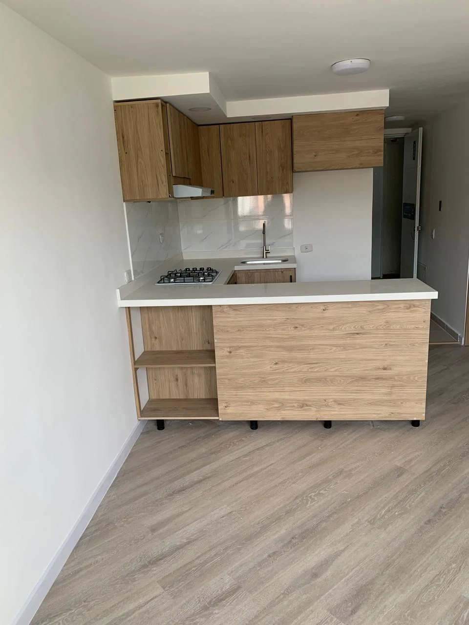
We completely redesigned the ad cards layout on mobile. The previous problem: on a 360px screen, the thumbnail + title + price were squeezed into a single row, and the title got cut off after three or four words. An ad that said "Apartamento amoblado en Poblado cerca del metro" only showed "Apartamento amoblado..." and you had to click to understand anything.
Now on mobile, cards have two rows: first row with thumbnail + full title (up to two lines) + category and city; second row with price, date and statistics. The title breathes, takes up the width it needs, and the eye reads from top to bottom without fighting the layout. On desktop the previous layout was still working, so we left that one the same.
Frictionless Bilingual
If your native language is Spanish, Colombia Move is in Spanish. If you prefer English, one click on the language toggle and everything translates — including filter labels, section titles, buttons, and ad badges. Without reloading the page, without losing your scroll position, without breaking a half-filled form.
Additionally, the titles and descriptions of each listing are automatically translated between Spanish and English when the user's language doesn't match. That means a Colombian seller posts in Spanish and a US buyer reads in English — both see their language, the seller never had to write two versions.
How to Use It Yourself
If you're new here, three places to start:
1. Post somethingWhatever it is — a job, a service you offer, an article you want to sell, a property for rent, or even something you're looking for. It takes two minutes. No commission, we don't ask for a card.
2. Explore a section that interests you. Use the new intent filters to narrow down. Notice the pink color on the cards — it alerts you at a glance which side of the ad is.
3. Ask a question in the communityIf you're thinking about moving to Colombia and have questions you can't find answers to in a blog, the community is where local people and experienced expats will answer you.
Tell us what works and what doesn't
This redesign isn't finished — it's just beginning. There are things we're still polishing this week based on what real people do when they come in. If you use Colombia Move and find something confusing, something that could be clearer, something that took you more clicks than it should have, tell me. Direct feedback from users in the first few weeks is infinitely more valuable than any metric I can look at alone.
You can write to me at the contact form or comment on this post directly. And if you find it useful, share it with someone looking to move to Colombia, or with a Colombian who wants to post something for free — those first users are what make the marketplace make sense.
Frequently Asked Questions
❓ Is it free to post ads?
Yes. Posting on Colombia Move is and will always be free — jobs, services, housing, vehicles, electronics, and everything else. There are optional paid options to highlight or promote a listing, but basic posting has no cost, and we don't ask for a credit card.
❓ What happened to the "Looking for" category?
We eliminated it as a separate category. Before it was a fifth separate category (apart from Employment, Service, Sale, Rental). The problem: it mixed people looking to buy a laptop with people looking for work with people looking for a chef — audiences that have nothing to do with each other. Now each listing has a "side" (offering or seeking) within its own type, so seekers find themselves within their specific vertical and not in a catch-all drawer.
❓ Why pink color?
Because it's visually opposite to green (sale) and indigo (rental). When you're reviewing 30 listings in a feed, pink screams "attention, this one is different!" — the person isn't offering, they're looking. A buyer scanning results can't confuse a pink listing with a sale one. And it's the same rule for all categories: pink = someone is looking, whether it's work, service, purchase, or rental.
❓ Do my old ads still work?
Yes, all of them. If you had an ad published before the redesign, it stays exactly as it was, with its original URL. We only automatically adapted it to the new model — an ad that was previously "Wanted" type now has the appropriate type (Sale, for example) with the "looking for" side, without you having to do anything. And if you want to edit it, the edit form already knows the new model.
❓ How do I change the language?
In the top right corner, next to the publish button, there's a language selector (ES/EN). One click and everything changes — including the filters, buttons, ad badges, and section titles — without reloading the page or losing progress if you were filling out a form.
One more thing
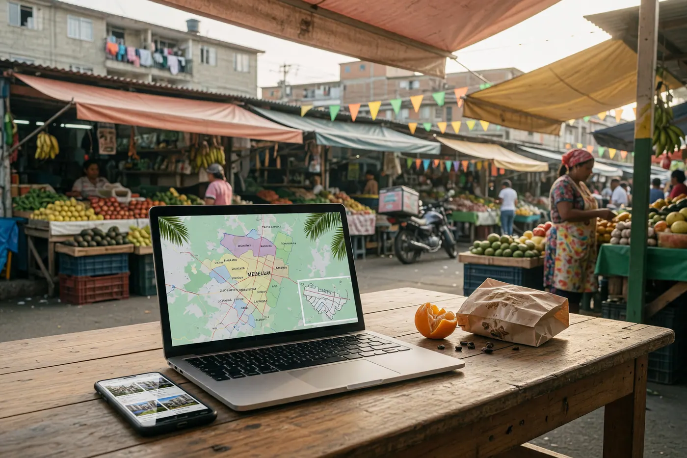
If you've made it this far and you're thinking about moving to Colombia — or you already live here and need something — give the marketplace a try. It's not perfect yet, but it's carefully designed by someone who lives in Medellín and uses the marketplace as a user first and as a developer second. Your feedback now, in these early months, is what will ultimately shape it.
Share it with someone. Post something. Break the form by trying to do something weird and tell me what happened. Thanks for reading this far.


Comments
Loading comments...
Checking sign-in status...